The center of the Milky Way can be heard as notes rising and falling, but no microphone is listening across the galaxy. The sound comes from data that people have mapped into pitch, volume, and time. It is a way of hearing an image.
Milky Way sonification brings space science to an listeners through a distinct sense. Bright points can become notes. Extended clouds can become a changing tone.
A musical work can then use those ideas in a more expressive form.
The distinction is worth keeping. A data translation and a composed piece are linked. But they do not follow exactly the same rules.
Neither is a recording of sound traveling from the galactic center to Earth.
Turning a Telescope Image Into Sound
Sound mapping maps features in data to things we can hear. In one Galactic Center project, image position affects pitch and brightness affects volume as a scan moves across the picture. The sound stands for measured light; it does not reproduce pressure waves logged by a microphone in space.
A graph already translates data into something we can sense. A higher point may mean a larger value. Sound mapping takes a similar step through hearing.
A higher note can stand for a position, while a louder sound can stand for a brighter source.
The rules matter because they give the listener a way to read the result. Without them, a sequence of notes may feel like atmosphere alone. With them, a change in sound can point to a feature in the data.
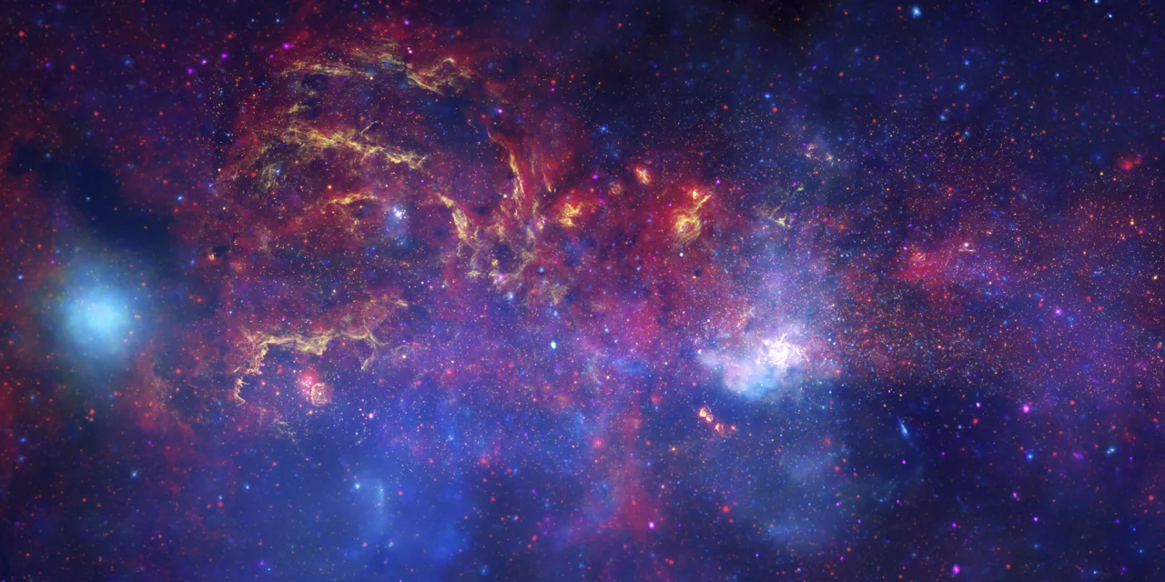
The Chandra project described a scan moving from left to right. That makes one image axis into time. Objects high in the image make higher pitches, while bright sources become louder.
The mapping is a design choice made to help people explore the picture.
Stars and compact sources can become individual notes. Broader clouds can become extended tones. Those contrasts give the listener clues to structure, though they do not give each detail present in the full data set.
The sound is not hidden in the image waiting to be extracted unchanged. Someone must choose a mapping, an instrument-like sound, a range, and a pace. A distinct useful mapping could make the same data sound distinct.
That does not make the result arbitrary. It means the rules need to be clear and consistent. A science display can have designed features while still standing for real measures faithfully.
The key question is therefore not whether the galaxy naturally plays these notes. It is what each change we hear means. Once the mapping is explained, the listener can use the sound as one more route into the records.
A short sound can show how the rule works. Take a bright point near the top of the image. Under this mapping, it becomes a high, loud note.
A dim point near the bottom becomes a lower, softer note. Move the scan from left to right, and their places decide when each note arrives.
The rule stays the same even if the sound chosen for a note changes. A piano-like tone and a bell-like tone can carry the same position and brightness. The listener needs to know which part is data and which part is a choice of sound.
Related Reading
That small example makes the larger track much easier to follow.
Several Telescopes Show Different Parts of One Place
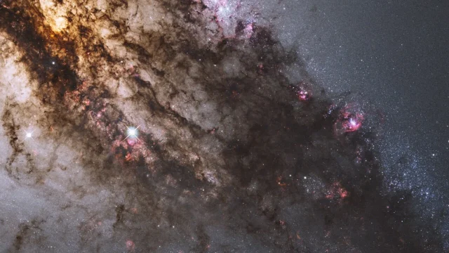
The Galactic Center image combines records from Chandra, Hubble, and Spitzer. These telescopes record distinct wavelength ranges, revealing distinct features. A composite image brings those views together; Sound mapping can stand for them separately or in combination, helping listeners contrast structures that one seen-light image would not show.
Human eyes see only part of the range of light. X-rays and infrared light need instruments suited to those wavelengths. The Galactic Center is a rich subject because distinct bands reveal distinct parts of a crowded and dusty region.
Chandra observes X-rays. Those data can highlight energetic sources and hot material. Spitzer supplied infrared records, while Hubble added a distinct view.
The combination is a record made in several kinds of light, not one normal camera exposure.
Dust affects which light reaches us. Infrared records can reveal features hidden or altered in seen light. That is one reason the same region may look very distinct across wavelength bands without any contradiction.
Assigned colors help display unseen wavelengths. A red or blue patch in a composite need not mean the material would have that exact color to a nearby human eye. The caption's color key is part of the account.
The same care applies when the bands become sound. A project may give distinct data layers distinct timbres or make them available separately. Listening to one layer can help reveal what was hard to distinguish in the combined version.
Sagittarius A*, the supermassive black hole near the center, is a key feature in the region. The image and sound stand for records of the area, not a microphone recording from inside the black hole.
Combining views is a strength when the contrasts remain seen. Each telescope adds data through its own measures. The sound can guide attention among those layers, making a complex sky scene easier to explore without pretending that one sense captures everything.
A Composer Can Take the Data in Another Direction
Sophie Kastner's Where Parallel Lines Converge draws on a composite Galactic Center image. It focuses on selected features rather than scanning the whole picture. This is a composed interpretation informed by data; it differs from a fixed-rule mapping that turns position and brightness directly into sound.
A writer makes choices about form, emphasis, and pacing. Those choices can be inspired by a datan image while still making a musical work. The result is not less meaningful because it is expressive, but its meaning is distinct from a measure display.
Kastner described focusing on smaller events within the image. The work draws attention to selected structures instead of treating the whole horizontal axis as a simple timeline. That creates a distinct way to follow the scene.
The Chandra project identifies features including an X-ray binary, arched filaments, and Sagittarius A*. These become parts of a music story. The listener hears a shaped response to the data, rather than a literal sound emitted by those objects.
The distinction can be compared with a science drawing and a painting inspired by the same subject. Both can help an listeners attend to something real. One follows rules meant to display features directly; the other can organize them for an expressive purpose.
Keeping that distinction clear protects both the science and the art. We do not need to claim the piece is a measured natural soundtrack. We can appreciate how it directs attention and invites a listener to notice distinct parts of the image.
It also prevents a misleading headline. The Milky Way did not send a new song to Earth. People used records to make a new route into the galaxy, then extended that route through musical imagination.
The title Where Parallel Lines Converge belongs to the piece. Naming it accurately helps readers find the work and grasp its place within the wider project, where direct data mappings and artistic responses can sit alongside one another.
Access Changes What an Audience Can Explore
Sound mapping can help blind and low-vision listeners explore space data through hearing. It adds a useful view rather than replacing all images or analysis. Clear notes help users understand each sound and compare it with other displays of the same observations and data.
A sky image can carry a large amount of data while being hard to access through sight alone. A sound mapping offers one more doorway. It can make changes in brightness and position easier to follow for some listeners.
Accessibility is not only a technical feature added at the end. It can shape how a project is designed, what it explains, and which choices it makes available. A useful sound display needs to be understandable, not merely playable.
Listeners also differ. Some may prefer separate wavelength layers. Others may use the combined version, a written account, or a visual contrast.
Offering more than one route lets people choose how to explore the material.
The method has limits. A short track cannot preserve each spatial link in a complex image. It may compress ranges or focus attention on certain features.
Those choices should be stated so the sound does not imply more detail than it carries.
Science analysis still uses the data behind the sounds and suitable methods. A beautiful tone is not independent proof of a black hole or a new object. It is a view of records that already need their own reading.
The broad lesson is that data can meet people through a few senses. Sight is one powerful route. But it is not the only one.
Sound can reveal patterns, encourage questions, and help a new listeners participate in the scene.
The final note fades, leaving no claim that space has become a concert hall. What remains is a new way to pay attention: measured light made audible through explained rules, and a galaxy made more open to people who encounter it in distinct ways.
Frequently Asked Questions
These questions clarify what the audio stands for, how one mapping works, and why a piece is distinct from a direct scan. They help listeners enjoy the result without confusing it with a natural recording. The galaxy supplies the records, while people design the route from data to hearing.
Is This the Actual Sound of the Milky Way?
No. The audio maps sky data into sound. It is not a microphone recording of sound traveling from the Galactic Center.
How Do Brightness and Position Become Notes?
In one project, vertical position sets pitch and brightness sets volume as a scan moves across the image. Other sonifications can use distinct mappings, which need their own account.
Is Where Parallel Lines Converge a Direct Data Scan?
It is a composed reading inspired by selected features of the image. That differs from a fixed-rule scan that maps the full image directly into sound.